


[adrotate group=”1″]
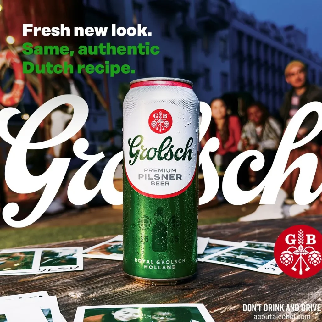
With over 40 years of dedication to authenticity, quality, and innovation, Grolsch unveils its updated visual brand identity in Canada. Ontarians can now enjoy Grolsch's craftsmanship and expertise through its refreshed appearance, marking a pivotal moment in the brand's journey.
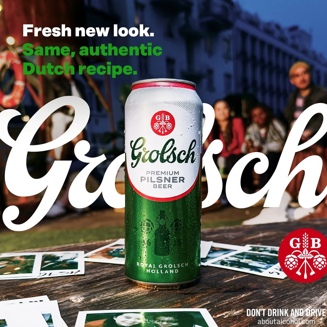
Founded in The Netherlands in 1615, Grolsch has established itself in the market through its craftsmanship and tradition. The name 'Grolsch' itself pays homage to its origins, symbolizing a legacy of excellence in brewing. At the heart of Grolsch's essence lies its iconic premium beer now locally produced in Canada and brewed with the same, authentic Dutch recipe loved by beer enthusiasts worldwide.
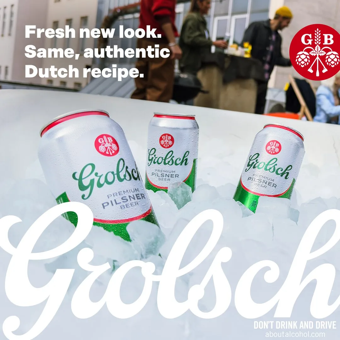
"We're excited to introduce a new era of Grolsch to Canadians. This transformation is not just about a new look; it's about finding new ways to make moments real through the entire experience," says Katie Wright, Head of Marketing at Asahi Canada. "From the shelf to the first sip - this new look and feel has been developed in direct response to what our consumers are looking for. By modernizing the design, while staying true to our rich heritage, this evolution allows us to elevate the Grolsch brand, and connect with today's discerning beer enthusiasts."
For Grolsch the new visual brand identity signifies its dedication to optimizing consumer experiences. Informed by extensive consumer research, the refreshed visual brand identity embodies distinctiveness, memorability, and new visual appeal. Their goal is to differentiate Grolsch from competitors, but also elevate its presence on shelves, embodying a premium aesthetic for consumers.
Photo Gallery:





(click to enlarge)
Agencies behind Eat the Code campaign?
- Agencies - Pomp And Circumstance PR
- Brand - Grolsch
(click on the link to view the agency's Vendor Directory listing)
[adrotate banner=”10″]
[adrotate banner=”4″]
[adrotate banner=”6″]
